Key Takeaways
- Business cards boast a conversion rate around 12%, significantly outperforming average website engagement for networking.
- Material choice, like thick 16pt+ paper and tactile finishes, directly influences perceived trust and quality.
- Prioritize scannable layouts and legible, sans-serif fonts (8pt minimum) for clear communication of contact details.
- Strategic use of white space and a focused hierarchy guide the eye to your most important branding elements.
- Integrating QR codes or NFC technology bridges the physical and digital, providing instant access to portfolios or websites.
- Consistency in color palette and typography across your card, website, and social media strengthens brand recognition.
- AI can be a powerful tool for generating concise, impactful taglines that capture your unique value proposition.
In a world of fleeting digital connections, a tangible business card remains a powerful artifact. It's a physical extension of your professional identity, a small piece of design that can convey your brand's essence before a single word is read. A well-crafted card acts as a silent ambassador, building credibility, showcasing professionalism, and ensuring your brand is remembered long after a handshake.
The Enduring Power of the Business Card
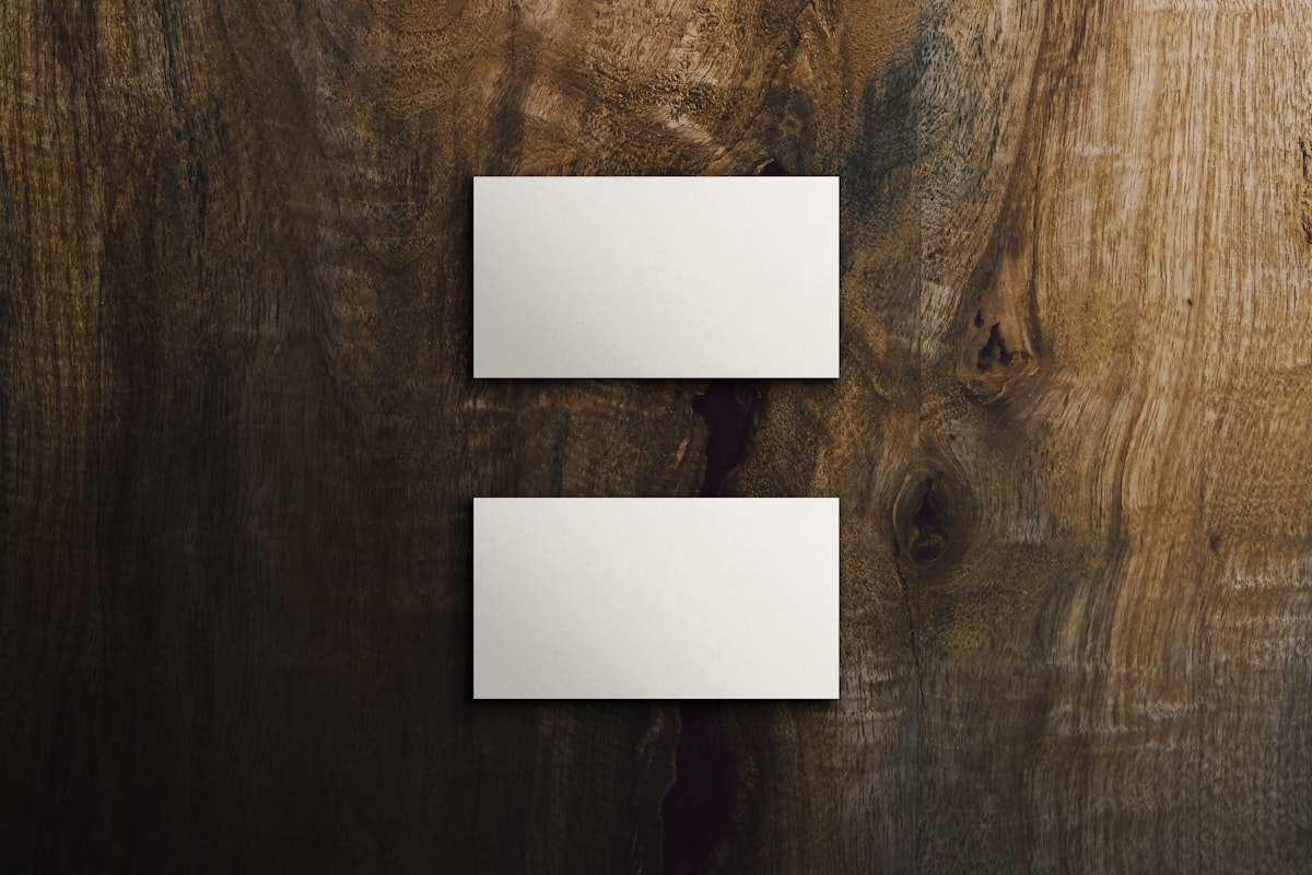
A business card is a compact, printed representation of your professional identity, typically measuring 3.5 by 2 inches. It serves the dual purpose of providing essential contact information and promoting your personal or company brand. In an era of digital overload, the tactile nature of a card makes it a memorable and effective tool. Statistics indicate that business cards have a notable average conversion rate, far exceeding that of a standard website visit in a networking context. This effectiveness stems from their physical presence—they are kept, glanced at, and act as a constant reminder.
The landscape of business cards has evolved far beyond the standard rectangle. Today, professionals can choose from a variety of formats to match their brand personality:
- The Classic Standard: The ubiquitous 3.5" x 2" card, designed to fit seamlessly into wallets and cardholders.
- The Attention-Grabber: Square cards (2" x 2" or 2.5" x 2.5") that stand out in a stack of traditional designs.
- The Modern Minimalist: Slim, mini cards that offer a sleek and contemporary aesthetic.
- The Informational Fold-Out: Folded cards that function like a small booklet, ideal for listing services or bilingual information.
- The Custom Shape: Die-cut cards crafted into unique shapes relevant to your industry, from tools to brand logos.
- The Functional Magnet: Cards with a magnetic backing, perfect for sticking to fridges or filing cabinets.
- The Digital Bridge: NFC or QR code-enabled cards that share contact details with a tap or scan, complementing the physical experience.
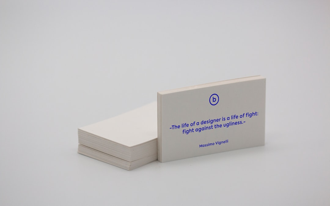
- The Premium Statement: Cards made from specialty materials like wood, metal, or textured paper for a luxurious, unforgettable feel.
Crafting a Visually Compelling Design
The visual design of your card is its first language. It must instantly communicate your brand's character and values through deliberate choices in color, typography, and layout.
Strategic Use of Color
Color psychology plays a pivotal role. Your palette should reflect your brand's personality, appeal to your target audience, and ensure text remains perfectly legible. A mismatched color scheme can undermine even the cleanest design.
- Blue conveys trust and stability, ideal for finance, law, and healthcare.
- Red or Orange signals energy and action, suited for sales, marketing, or entertainment.
- Green evokes growth and wellness, perfect for eco-brands or health coaches.
- Neutrals like Black, White, or Gold communicate luxury and sophistication for premium services.
- Bold, vibrant mixes showcase creativity and innovation for designers and agencies.
Adhere to simple rules: maintain high contrast for readability, limit your palette to 2-3 primary colors, ensure consistency with your broader brand identity, and always request a physical proof, as colors can shift from screen to print.
Typography for Readability and Brand Voice
With text often at very small sizes, font selection is critical for both legibility and brand alignment.
- Sans-serif fonts (e.g., Helvetica, Inter) offer a clean, modern, and highly readable look, excellent for tech and digital services.
- Serif fonts (e.g., Garamond, Times New Roman) project tradition and trustworthiness, fitting for law, finance, or academia.
- High-contrast serifs or script fonts can be used sparingly for names or logos to add an elegant or creative touch, but should be paired with simpler fonts for body text.
Establish a clear hierarchy with font sizes: your name or business name largest (12-16pt), followed by job title (10-12pt), contact details (8-10pt), and any tagline or small print (6-8pt). Use no more than two font families and employ weight (bold, regular) to create visual structure.
Intuitive Layout and Information Hierarchy
A logical layout guides the recipient's eye effortlessly to the most important information. Common approaches include a clean, minimalist front with contact details on the back, or an information-dense single side with logically grouped elements. For a modern twist, a visual-first design with a striking image on the front places all text on the reverse.
Key layout principles include using ample white space to reduce clutter, aligning text (often left-aligned for faster scanning) consistently, and positioning all critical elements at least 3mm from the edges to avoid trim issues. Only include contact methods you actively use, and consider omitting a physical address if your business is primarily online.
Selecting Materials That Make an Impression
The paper and finish you choose translate your brand promise into a tactile experience. The wrong material can contradict your message—an eco-brand on glossy plastic, or a luxury service on flimsy paper.
Paper Weight & Type: Standard 14pt cardstock is cost-effective and professional. For a more substantial feel, upgrade to 16pt or even ultra-thick 32pt, which conveys premium quality. Textured stocks like linen or cotton feel elegant and traditional, while kraft or recycled paper aligns perfectly with sustainable, earthy brands.
Finish & Coating: A matte finish provides a modern, non-reflective surface that is easy to write on. A gloss coating makes colors pop and adds durability. For a truly luxurious feel, soft-touch lamination creates a velvety, tactile experience. Specialty finishes like spot UV (a glossy raised effect on specific areas), foil stamping (in gold or silver), or embossing add sophisticated, memorable details.
Always request physical samples before a full print run, ensure QR codes scan perfectly on your chosen finish (gloss can sometimes interfere), and remember that thicker, textured paper often requires slightly larger, bolder fonts for optimal readability.
15 Proven Templates for Instant Impact
Need a starting point? These high-impact templates can be adapted to any industry:
- The Minimalist: Ample white space, a clean sans-serif font, and only essential information.
- The High-Contrast Statement: Dark background (black, navy) with crisp white or metallic text.
- The Color Block: A bold split of a brand color and white, creating dynamic visual interest.
- The Visual Portfolio: A full-bleed photograph on the front, with all text cleanly presented on the back.
- The Vertical Orientation: A portrait-style card that breaks the horizontal mold.
- The Call-to-Action Card: Uses the back for a specific offer, discount code, or compelling reason to engage immediately.
- The Monogram Elegance: Features a large, stylized initial as the central design element.
- The QR-Code Integrated: Makes the scannable code a deliberate and stylish part of the layout.
- The Eco-Conscious Craft: Utilizes kraft paper, muted tones, and simple, natural illustrations.
- The Brand-Focused Split: Front for a bold logo, back for all organized contact details.
- The Foil Accent: Matte cardstock elevated with a strategic splash of gold or silver foil.
- The Industry Icon: Incorporates a subtle, relevant silhouette or icon as a watermark.
- The Service Menu: Back of the card lists key services in a clear, bulleted format.
- The Appointment Hybrid: Includes a designated space for writing in appointment details.
- The Ultra-Premium Edge: Ultra-thick stock with a colored painted edge for a stunning, detail-oriented finish.
Infusing Your Card with Memorable Branding
Your business card should be a microcosm of your entire brand experience. Consistency is key to building recognition and trust.
- Logo Placement: Position your high-resolution logo prominently, typically where the eye naturally lands first.
- Powerful Tagline: A short, benefit-driven phrase (5-7 words) that explains your unique value. Tools like remove AI detection can help brainstorm creative, human-sounding options that avoid generic jargon.
- Consistent Visual Identity: Strictly use your established brand colors and fonts. Inconsistency creates confusion and dilutes your professional image.
- Smart Use of Technology: Integrate a well-designed, tested QR code that links to a specific, valuable destination like your portfolio or booking page.
- Leverage the Back: Don't leave it blank. Use it for a quote, a summary of services, or a striking visual element.
- Meticulous Proofreading: A single typo can shatter credibility. Review meticulously and have a second pair of eyes check all details.
Leveraging AI for Brand Clarity and Creativity
One of the biggest hurdles in card creation isn't the design software—it's finding the perfect words. Generic titles and vague descriptions fail to make an impact. A compelling tagline or business name must communicate your unique value succinctly and memorably.
This is where AI-assisted ideation becomes invaluable. By inputting a simple description of your business, you can generate dozens of potential taglines, scoring them for brevity, clarity, and memorability. Similarly, if you're launching a new venture, AI can help brainstorm short, brandable business names and even check for domain availability. This process solves the "blank page" problem, providing a strong creative foundation before you even begin the visual design. The goal is to start with powerful, human-centric messaging. For content that needs to sound authentically personal, a specialized tool can help you escape AI detection and ensure your brand voice resonates genuinely with your audience.
Conclusion
A custom business card remains one of the most cost-effective and tangible marketing tools at your disposal. Its power lies in intentionality—a deliberate fusion of clear branding, strategic design, and quality materials. Whether you source printing locally or order premium finishes online, the core principles endure. Start by defining your core message, perhaps with the aid of modern brainstorming tools. Then, translate that message into a visual format that feels authentic to your brand. In a world of digital noise, a thoughtfully crafted business card is a lasting physical touchpoint that makes your first impression count.